Is The Image Of An Emission Nebula An Object Of Beauty?
In order to answer this question, I first need to define Beauty and the concept of Beauty in general. To do this, I will summarise the development of the concepts of Beauty through the ages, drawing unashamedly on the excellent book “On Beauty” by Umberto Eco (ISBN 978 0 85705 020 5) as a significant point of reference and applying this to four images.
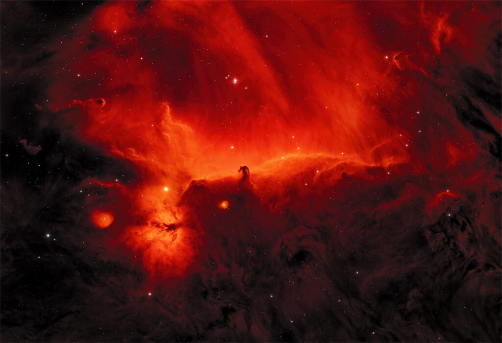
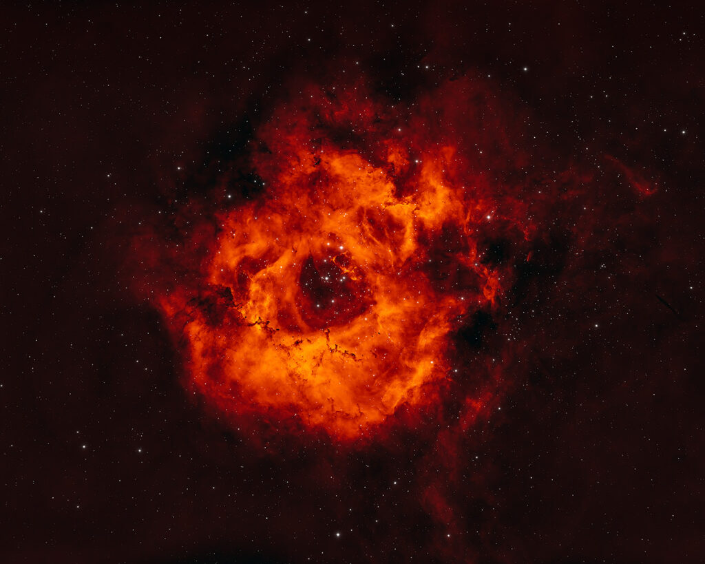
The four images to which I will be returning are a rose still-life, an image from the series “Essence of Autumn” from my nature photography, and two images from the Flaming Sky Showcase: The Horsehead Nebula and the Rosetta Nebula. This choice is very deliberate. For example: By choosing images that effectively share the same colour palette, I can avoid (or rather adjourn to another occasion) the distracting discussion of the perception and preference for one particular colour over another, whereas the rose still-life and the Rosetta Nebula, so named due to its likeness to a rose, will enable me to tease out some important nuances within the concepts that I will be exploring.


Two of the most important concepts of Beauty come from Plato: Beauty as harmony and proportion between the parts (derived from Pythagoras) and the Beauty of splendour. As somebody who may be said to be ‘borderline OCD’, the first resonates deeply in a very positive sense within me. It lies, amongst other things, behind the perspicacity to see through to the fundamental components of a motif. This harmony and, and of, proportion Nietzsche called Apollonian Beauty. Its antithesis, Dionysiac Beauty, chaotic and above reason, was not to emerge in art until the modern age. The Beauty of splendour is more elusive, but I would see this as a forerunner, initially, of Thomas Aquinas’ ‘Claritas’ (clarity and luminosity, vide infra) and eventually, Kant’s Sublime, of which I will very much have need later in the discussion.
To the ancient Greeks, when contemplating art or nature, vision (and sound) was much more important than taste, touch, and smell, that is, that a distance should be maintained between the viewer and an object. This concept has been very much carried forward into modern western culture, and is indeed very relevant for this discussion, only to be finally supplanted by the “Happenings” and immersive events of the Avant-Garde.
From the earliest concepts of harmony where the disharmonious was seen as evil and bad, a concept was developed, initially proposed by Hericlitus, and later incorporated into Pythagorean doctrine by Philolaus and Architas (fifth to fourth centuries BC), whereby, true harmony was not to be seen as the absence of the disharmonious but rather as an equilibrium between the two. For example: beautiful/ugly, dark/light, big/small, good/bad. Thus, giving birth to “one of the finest canons in the art of Classical Greece” the concept of symmetry.
It is hard not to underestimate the consequence of this Platonian view of Beauty with its Pythagorean principles on Art in the Middle Ages, the Renaissance, and beyond with these ideal models being studied and celebrated by, amongst others, Da Vinci and Dürer. From Pacioli, for example, we get the “Golden Section” to which the “Rule of Thirds” is a close approximation. Indeed, as soon as we begin to draw lines through an image or photograph to demonstrate how we arrived at, constructed, or chose a particular motif we too are celebrating these very models.
Roses – Still-Life:

To clarity and proportion, Thomas Aquinas added a third concept of ‘integrity’. That is, in order to be beautiful an object must also be suited to the purpose for which it is intended. When we look at the roses still-life, it shows a very modern rose hybrid. One in which the “young tulip like” form is retained throughout the maturation of the flower head. The proportions of this type of rose, I find particularly pleasing (in the sense of being harmonious and in proportion) yet to arrive at this hybrid the breeders have had to sacrifice the scent of the rose compared to more tumultuous and voluminous antique rose varieties. However, in as much as anything in nature can be assigned a function, a rose flower has the function of attracting a bee to ensure pollination and the scent of the rose is an integral part of this function. As such, here, in order to produce this rose variety, its integrity, in the sense Thomas Aquinas intended, has been severely compromised. In terms of the still-life image, the distance between the original object, the rose, and the observer is implicit and the compromised integrity remains hidden from us, we must judge its Beauty based only on our sense of vision. With the rose itself, it is our own preference to view the object from a distance, that hides the loss of integrity, assuming anthropomorphically, and in this case incorrectly, that it is only the visual form of the flower to which the bee is attracted. The ultimate embodiment of the visual functionality of a flower is to be found in the Orchid, where, even in nature, the functionality of the flower is to be found solely in its complex, though very harmonic, visual form.
Essence Of Autumn:

If we turn to the second image I have chosen, an example of the “Essence of Autumn”, there is no obvious functionality in the depicted subject and the harmony of proportion, though present, takes a very subordinate role to that of the light and colour within the image – the ‘Claritas’. By rapidly moving the camera between different fixed positions in a single, very long exposure, the contribution of the structure and form of the maple leaves, though they necessarily remain recognisable, is also downgraded to a contextualising role. The image mixes the bright primary colours associated with the Middle Ages, with the concept of ‘free Beauty’ legitimised during the Enlightenment. Plotinus (3rd century AD) wondered “why it is we ascribe Beauty to the colours and light of the sun, when they do not draw their Beauty from symmetry”. His answer was that “the simple beauty of colour is given by a form that dominates the darkness of matter, by the presence of an incorporeal light that is none other than reason and idea”. From this we also arrive at the “beauty of fire, which shines in a way similar to an idea” and which, not coincidentally, shares the colour palette of the images I have chosen. As already stated, the autumnal colours themselves do not directly have a function but are merely a consequence of the senescence of the leaves as they die prior to being discarded by the tree as it prepares for winter. This transition from the ‘green of summer’ is seen by many, myself included, as a development of Beauty, an example of the ‘Beautiful Death’ if you like, and certainly as represented here, an extension of the platonic idea of Beauty as splendour. And yet, the same transition in a bunch of roses in a vase, is often conversely considered to be a loss in Beauty and usually results in the bunch of flowers being rapidly discarded or replaced. I view this differently and find the developing structures and new colours as the roses ‘die’, to be a different Beautiful Death. This development of new structure and colour as a natural object ages and dies is an aesthetic theme that has fascinated me since, at the age of twelve, I drew a series of six sketches of a single rose over the course of several weeks, as it opened, matured, and died. A representation of this beautiful change, by way of example, would be the following image:

In a sense, this moves us to the eighteenth-century idea of subjectivity, that is, a beautiful thing is defined by the way we apprehend it, thereby shifting the emphasis away from the rules for its production or recognition and this brings us to my third image, the Horsehead Nebula and Kant’s idea of the Sublime. By defining Beauty as the means by which we perceive a subject, we are attesting to the “full rights of the subject to play a complete role in the experience of Beauty”, and, with eighteenth century travellers experiencing new and astounding natural sights, the Sublime as a definition of Beauty and as an effect of the ‘Wonders of Nature’ on the observer became an established principle. The problem then, as an artist of those times, was how to represent this Sublime in an image. A problem Casper David Friedrich addressed by showing us people, with their backs turned towards us, as they observe and contemplate the Sublime.
The Horsehead Nebula:

The Horsehead Nebula image portrays ICI 434 as the nebulosity behind the horsehead as well as the Flaming Nebula to the lower left. The image is comprised of data from two narrowband filters that capture the so-called hydrogen-alpha and the sulphur-II emission lines. Both of these emission lines are in fact in the red end of the visible spectrum: Scarlet and crimson would be a close approximation. However, the human eye is particularly insensitive to subtle variations in hue and luminosity in this region of the visible spectrum and particularly when the colours are very saturated as is necessarily the case here. As such the sulphur-II data has been colour mapped to yellow, thereby providing a significantly greater differentiation of the details that are available. The end result I find to be particularly intense. This is wonderfully consonant with Kant’s idea of the ‘dynamic Sublime’, where it is not the infinite vastness that touches us so dramatically but rather the idea of infinite power. In a terrestrial environment the perfect example of which would be a storm, and the most inspiring image I can think of that displays this power, would be William Turner’s “The Snowstorm”. In the first instance, the image of the Horsehead Nebula and the surrounding nebulosity is the representation of an object of unimaginable dimensions. And, as something that cannot be imagined, the size and scale of the object become effectively meaningless. However, the chosen colour palette lends itself to the idea of the Beauty of fire (vide supra) and one can almost imagine the roaring flames of a hundred burning suns, hidden behind the dark nebulosity of which the horse’s head is apart, the intensity of which is burning through the cloud and turning the cloud behind and above into an incandescent conflagration. Yet, and somewhat ironically, even as we imagine this idea, we are imagining something considerably smaller than the object which the image actually portrays: By scaling the image down in our imagination we arrive at something, the enormity of which we can imagine, and which can then, almost epiphanically, overwhelm us. However, whilst the image remains faithful to the subject, in order to portray this idea of the dynamic Sublime within this image the colour palette of the image is well removed from its ‘natural colour’. Here then I am drawing upon an idea, within the limits of the photographic process, developed between the fifteenth and sixteenth century, where Beauty is found coherently between both the invention and imitation of Nature: “Where the artist, without this seeming contradictory, was both a creator of new things and an imitator of Nature”.
The Rosetta Nebula:

When we turn to the fourth and final image, the Rosetta Nebula, this sense of the dynamic Sublime, although the image shares the same colour palette, is not present to the same extent. Rather, as an image of an object that is in fact 130 light years in diameter, we are again dealing with an object whose size is effectively meaningless, and, since we cannot harness it into a single thought, becomes an overwhelming infinity that is “beyond the grasp of both our senses and imagination”. This is Kant’s alternative idea of the Sublime, the mathematical Sublime. However, there is more to consider with this image than this. It shares through allegory, the harmony and proportions of a small beautiful terrestrial object, a rose, and this allegorical link subconsciously contradicts this sense of the infinite. The colour palette, again designed to maximise the perception of available structural nuances, has been achieved by taking the highlights of the red hydrogen-alpha emission data and transposing them to yellow. I could in theory have chosen any complementary or contrasting colour combination to achieve the same effect: Green/yellow, blue/yellow, blue/cyan, blue/red, etc. Yet to me, it is only the red/yellow combination (with its orange intermediate hues) that, on the one-hand retains a degree of faithfulness with the object represented, and yet creatively bridges to both a rose colour palette that I find particularly attractive and the idea of the Beauty of fire: The idea that we are looking, as indeed we are, at an object that shines with its own dramatic ‘Claritas’. A ‘rose in flames’ one could consider as being a prefect embodiment of Plato’s splendour, which at the same time, is something that is harmonious in proportion. Ultimately, it is the tension induced between the appreciation of both the ‘infinite’ and the ‘small’, returning us fully to the classical Grecian canon of symmetry, that is the vital impulse behind the emotional perception of this image.
I hope that this article has helped to provide the answer to the question originally set, at the very least in the context of the two nebula images I have discussed. At the same time, it should provide an insight into some of the thought processes and creativity that accompany our work, both terrestrial and celestial. I believe Art makes us truly human, or perhaps more accurately, the ability to appreciate the Beauty in form, color, shape and structure of an object, painting, sculpture, or photograph makes us human. It can define who we truly are. For me, the connection it can bring, maybe even should bring, to our natural world is a truly fulfilling and ultimately, an undeniably real, and fundamental source of meaning.
It should be of no surprise that both myself and Ines always want to create an image to which the observer will feel an emotional involvement, above all, we want to create something that is beautiful.
Eco quotes Leonardo da Vinci as clearly stating that, “imitation is, on the one hand a form of study and inventiveness that remains faithful to Nature … [], on the other hand, an activity that also requires technical innovation and not a passive repetition of forms”.
It is never just a photograph.
Mark
Note added in postscript: During the preparation and completion of this article, we discussed the ideas and concepts involved many times. During those discussions, we realized that with a couple of our astronomical images we had unwittingly compromised the intended artistic result in order to align with some ‘commonly accepted canons’ for the reproduction of an astrophotograph. Those images have been re-worked to achieve the artistic result originally intended and the respective images replaced on the website – “It’s good to talk …”